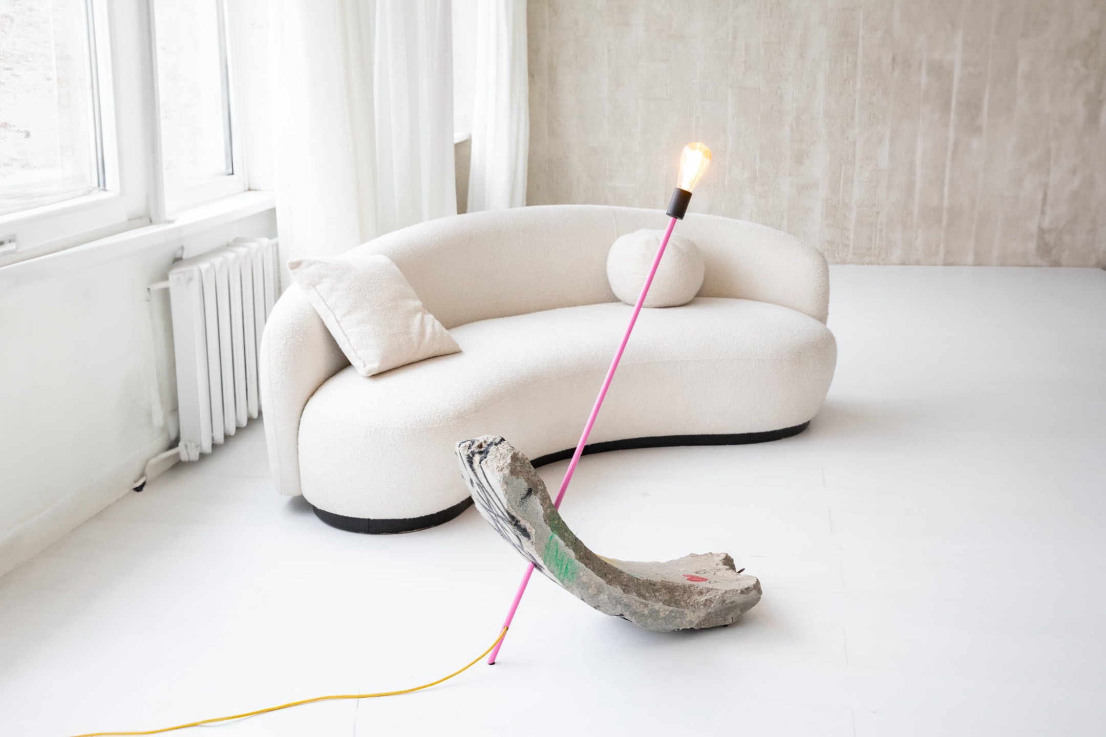
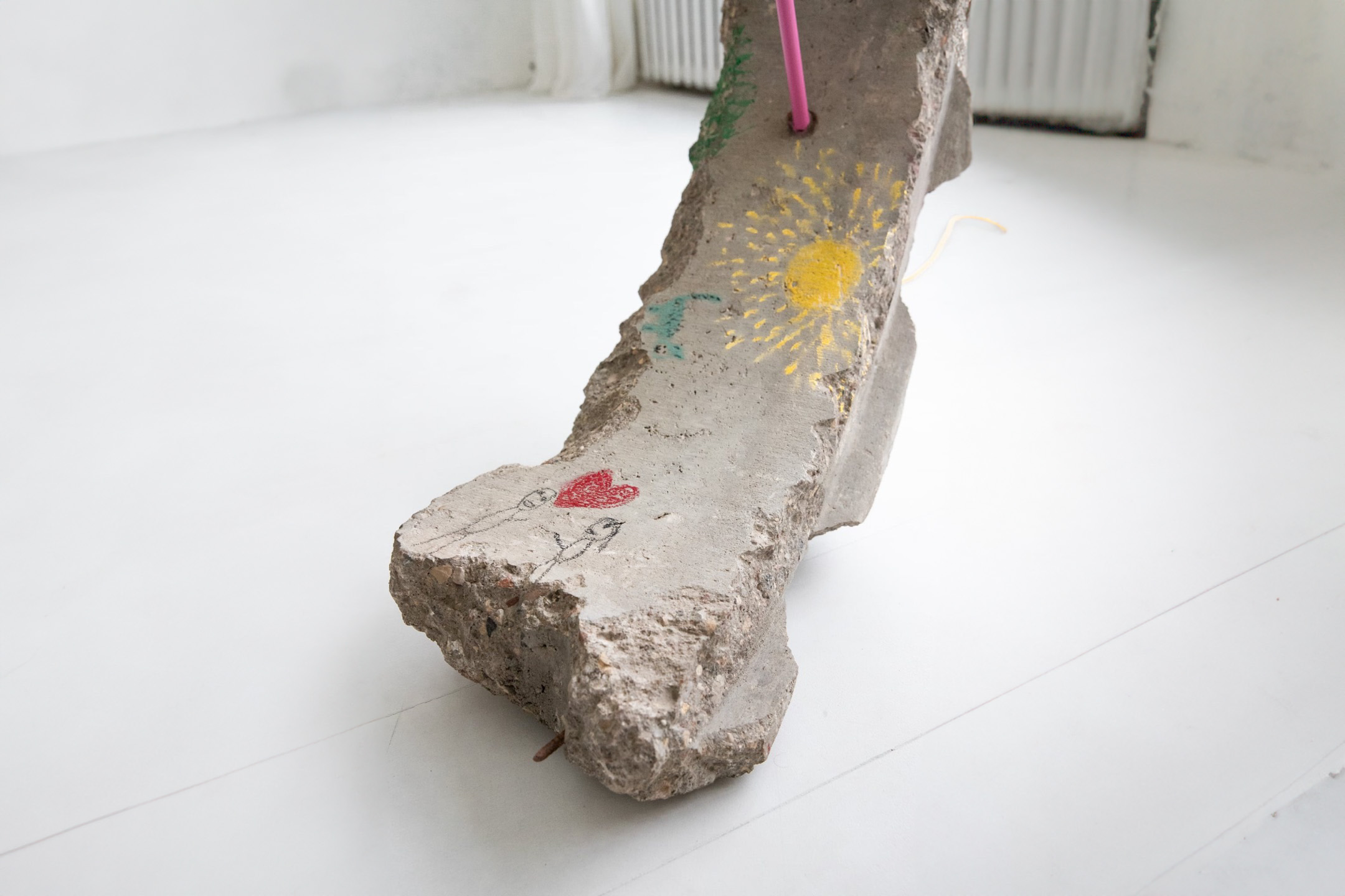
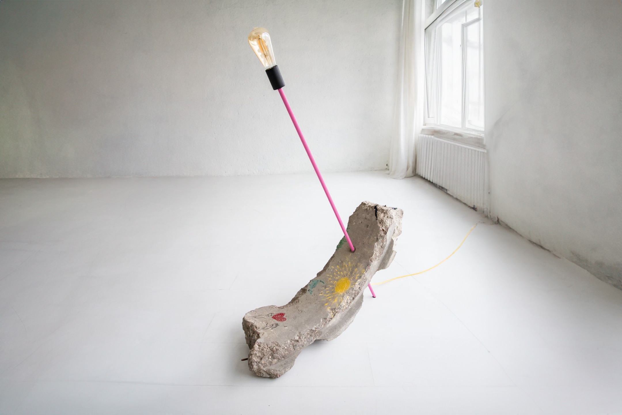


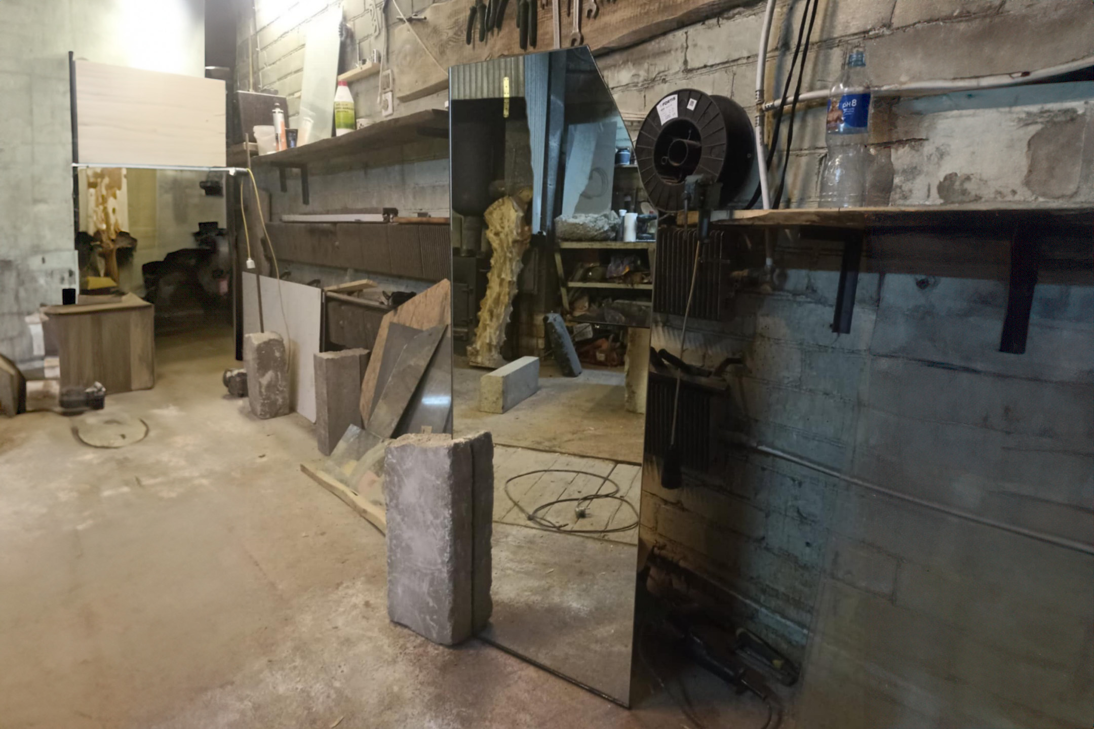
Kaunas ring lamp
NR. 017
‘Kaunas Ring’ is not only an object of light, but also a metaphor for the city’s history, childhood memories and human connections. It is a product that intertwines brutal concrete, minimalist design and poetic street language. The base is made of an authentic section of a well ring – an urban heritage fragment that was once part of the city’s infrastructure. The heavy concrete is pierced with one solid metal rod, which extends upwards and becomes the structural basis of the lamp – holding all the weight and the light source. The thin, bright pink tube contrasts with the massive concrete, creating a visual tension between lightness and weight. The drawing is two little people standing opposite each other, between them is a red heart. This is a symbolic connection of love. The sun, the earth and a cat are visible next to each other – seemingly simple, but deeply symbolic motifs that speak of warmth, home, and connection with the world. The drawing resembles a child’s crayon art – sincere, free, as if it grew out of an apartment building courtyard. Next to the drawing – a spilled graffiti tag. It is the voice of the city: not always neat, but true. This composition of tenderness – a scene of gentle, naive love and the rough marking of the city – creates a dialogue between two worlds. It is like a suspended moment between the childhood courtyard and the city streets.
*Price varies based on size and artwork detail.
CONTACT ME


Orbit
NR. 009
This is a sculptural light installation, born from an old, abandoned engineering element. The concrete ring, which until recently would have been simply a detail of a sewer or other system, now becomes a symbol of the cycle – a light of movement, city life, waste transformation. The structure is pierced by a steel reinforcement bar, which frames the form, and as if turns on its new orbit – this time not underground, but in the context of art. At its top – a minimalist light bulb, as if igniting a new idea: everything can come from nothing. This is the light brought by recycling, rethinking and design. Graffiti-like signs on the concrete – these are the voices of the city, untidy stories, random emotions, left as scars on the city’s skin. The object stands as if frozen in time, but at the same time it shines – modernly, boldly, uncomfortably.
*Price varies based on size and artwork detail.
CONTACT ME


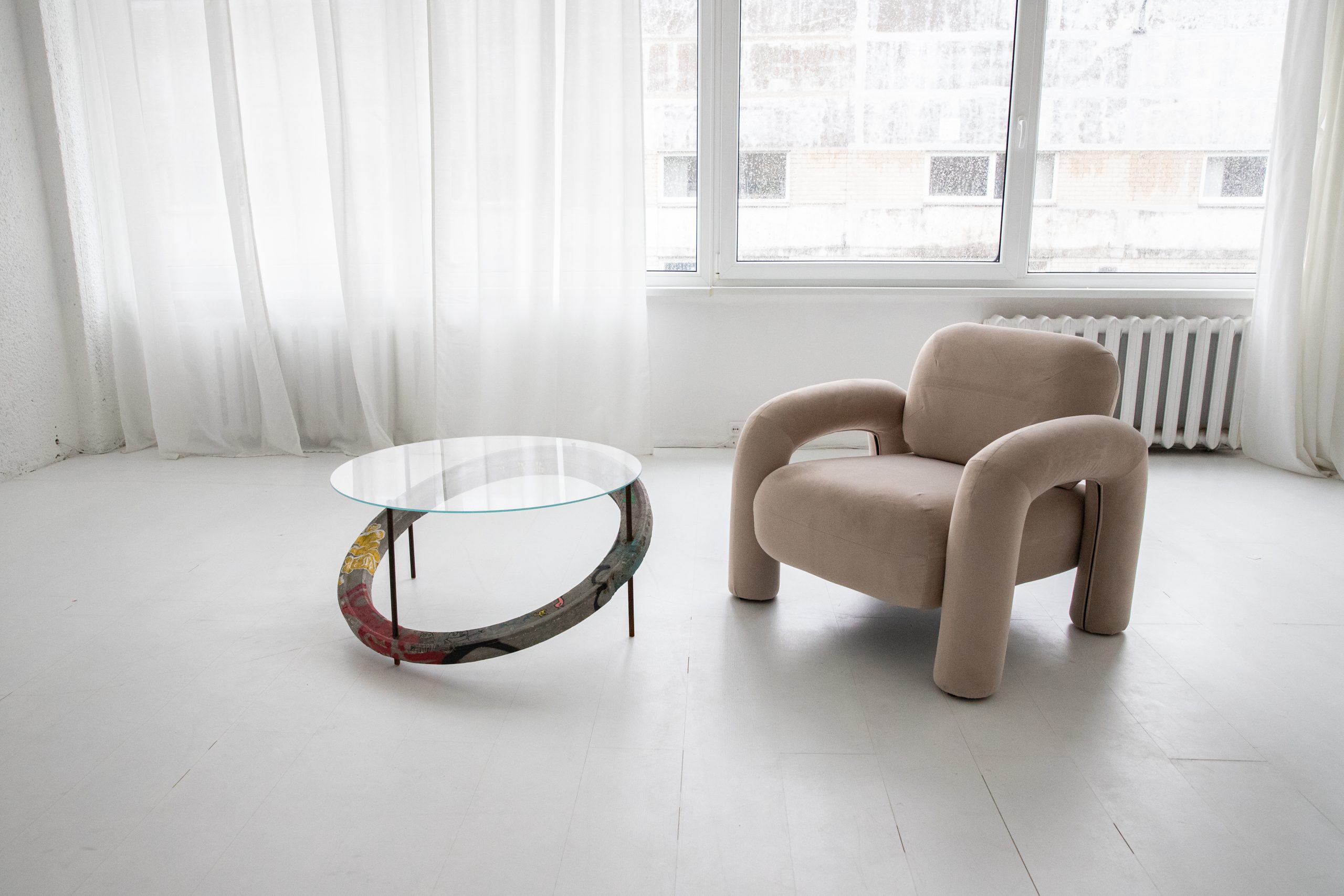
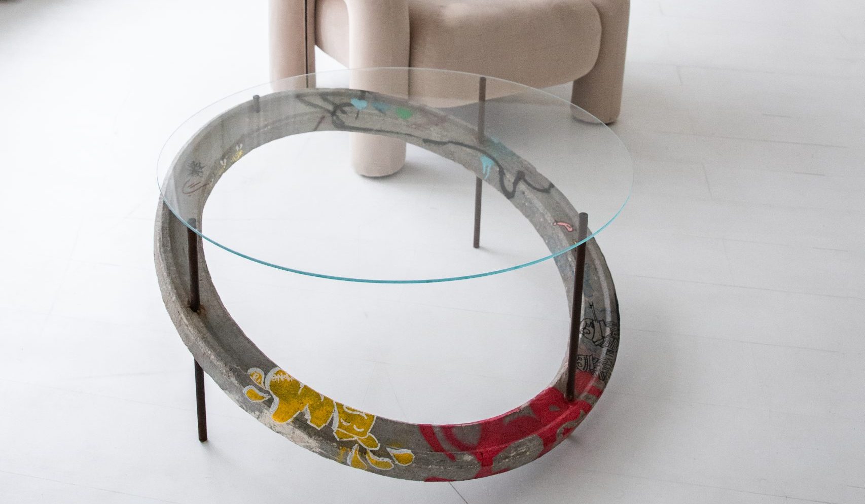
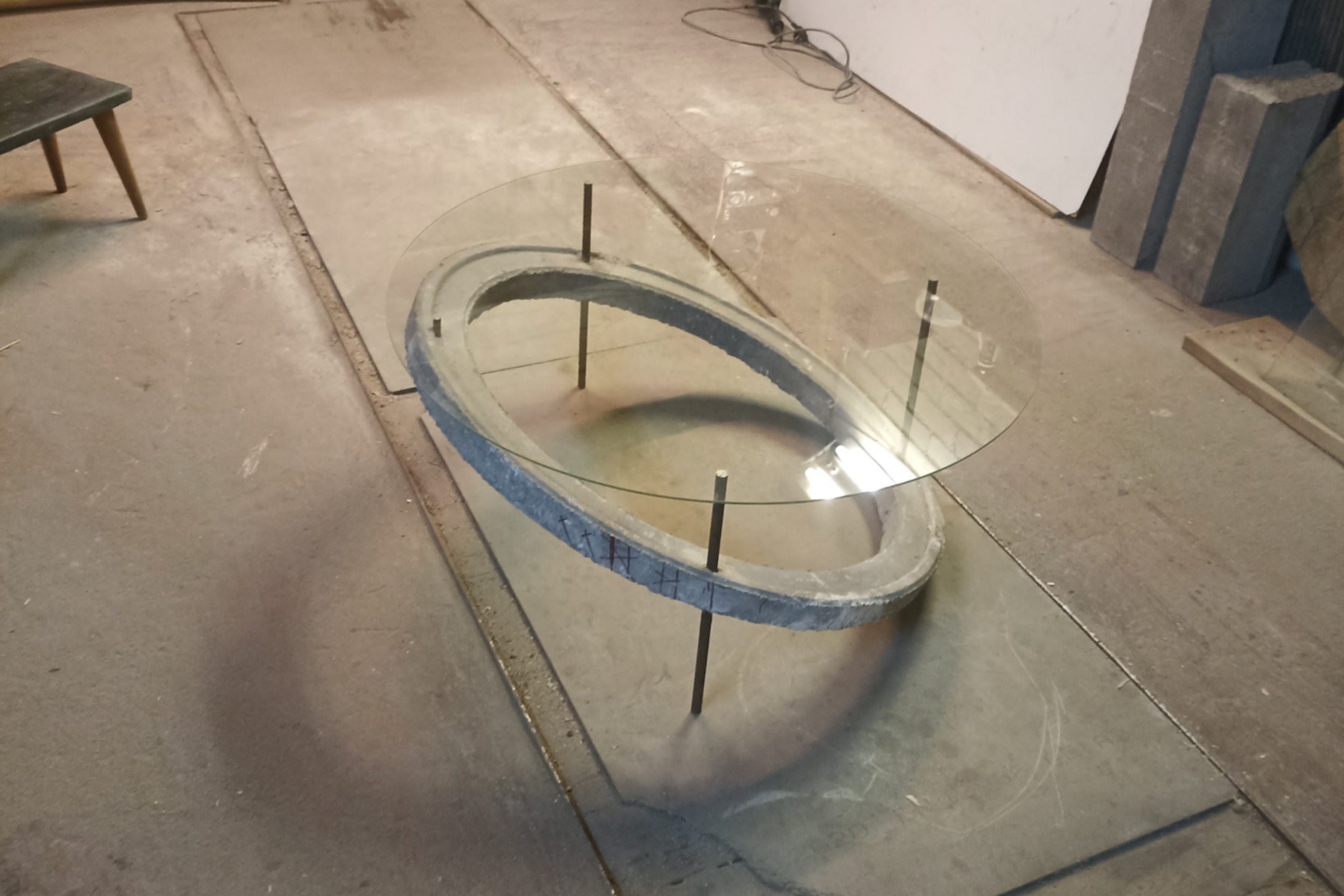
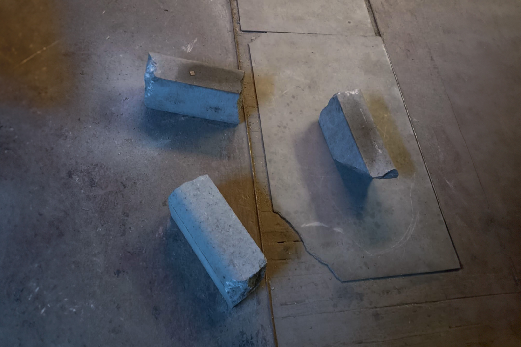
Ring compound
NR. 005
This object is two intersecting concrete arches created from ‘defective’ well rings, which could once have been functional parts of the city’s infrastructure. Now they are reinterpreted into a sculptural table leg, on which a minimalist glass plane rests. Well rings are usually associated with urban underground systems – invisible but essential networks that keep the city “alive”. Here they are reborn in a new context. The shape of the rings creates an impression of infinity or uninterrupted movement – like the circle of life of the city’s inhabitants. The compact arches symbolize the connection between function and aesthetics, between the purpose of the past and the vision of the present. Visible graphics, paint residues and concrete texture speak of the city’s street, walls, undergrounds – of authentic, unrefined urban heritage. The glass surface on top is light, transparent, as if in opposition to the concrete. This gives the furniture a balance: mass and transparency, strength and light. This form is suitable both as an interior accent and as a functional table, and at the same time becomes an artistic statement. This is a fragment of the city that has received a second breath. It invites us to look at the environment around us differently – even what was underground can become the basis for creativity. This is not just a piece of furniture – it is an urban manifesto that tells about the transformation of the city and the human relationship with space.
*Price varies based on size and artwork detail.
CONTACT ME


Mirror freedom
NR. 012
This mirror is made of concrete blocks – leftovers from a manufacturing process that would otherwise have simply become construction waste. On it – the word “Freedom”, painted in a bright, playful font that contrasts with the rough textures of the concrete. The inscription not only reminds us of the former Kaunas cinema, but also invites us to reconsider what freedom means today – individually and socially.
The cracked corner of the mirror is a natural mark of time and material, like a random moment that creates character. It is not a wound, but rather an unexpected fracture in the landscape – an expansion of the boundary, inviting us to look wider, not only at our own image, but also at the environment from which it arises.
*Price varies based on size and artwork detail.
CONTACT ME


Mirror crater
NR. 018
The mirror is embedded in a chaotic pile of concrete – like a crater or an urban artifact. It is a frozen moment between construction and demolition, where massiveness merges with fragility.
The object speaks of the materiality of the city – what remains after change, demolition, renewal. The mirror becomes a window into itself, and the texture of the concrete – the surface of the earth, which hides the stories and memories of former buildings.
*Price varies based on size and artwork detail.
CONTACT ME


Street light
NR. 015
City Light is a lamp that combines urban matter and existential warmth. Its base is a concrete block, once a city landmark or obstacle, now raised to a new format of existence. Imperfect, cracked, but authentic. On its surface are graffiti signs, like voices from underground tunnels, where a real city breathes. A thin, vertical rod grows out of this concrete – like time or thought rising upwards. At its top is a ball of warm light, like a gently brown-shining sun. Its rays are not dazzling, not demonstrative – it is not a decorative object, but a silent memory of the day, of the fragility and beauty of life. It is not a lamp – it is a fragment of life. It does not talk about perfection, but about survival, about the fact that every detail, even if it seems unnecessary, has the ability to transform. Not recreated, but salvaged – this construction speaks of saving raw materials not as a trend, but as a part of being. This creation is a reminder that even in the roughest material, light can be found. That beauty is revealed not on the surface, but in the story it carries with it. The light of the city not only warms the space, but also reminds us that it is possible to live differently.
*Price varies based on size and artwork detail.
CONTACT ME


Elephant
NR. 003
The Pink Elephant is a legendary piece of Kaunas street art. It was born from a simple tag – “Deima + Arūnas”, left by someone on the concrete fence of E. Ožeškienė Street. From a normal point of view, this inscription, like most others, can be called a mess, a mess, urban pollution. However, if you look at it from a different angle and take a closer look – it radiates sweet, positive feelings. “Pink feelings”, as the author of the work, V. Jakas, would say, painted an elephant next to the names of the immortalized lovers in 2014. This Pink Elephant embodies love, great tenderness and warm pink feelings.
*Price varies based on size and artwork detail.
CONTACT ME
INVISIBLE
NOT FROM NEW. FROM WHAT IS. WHAT IS INVISIBLE.
A collection from raw materials that already existed.
This collection is not created from newly produced materials. It is made from what is left. From what is often considered unnecessary – concrete remnants, broken glass, street fragments, structural details that were once invisible. Nothing is changed here. It is not cut, melted, or polished beyond recognition. This is not a design invasion, but a connection. We connect what already has a form, texture, and history.
STREET + CLEANLINESS
This collection is the energy of street art brought into a sterile space. It is an aesthetic of contrast that does not force you to choose between “beautiful” and “uncomfortable”. The pulse of graffiti, the breath of the city, the poetics of the edges of the street. Concrete here is no longer cold – it speaks, it remembers, it pulsates. This is a body in which time lives. The form in which the message is left. Brutality does not interfere – it grounds. The chaos of the city becomes a visual nugget when introduced into a clean, refined space. It is like dirty hands in a white gallery – and that is why the message comes across clearly.
THE LANGUAGE OF MATERIALS
This is not recycling, but reusing. Raw materials do not change their essence – they take on a different role. What was pavement becomes a surface. What was considered waste – becomes an aesthetic center. Concrete – not a problem, but balance. Glass – not fragility, but an authentic sign that something has been lived in. Mass, weight, lack – this is what creates stability and character.
IN THE CITY – LIKE IN THE FOREST.
Rubble, remnants, broken concrete – here are like fallen leaves. Not garbage, but the beginning of a new form. Like leaves in the soil, they decay, nourish, become the basis for something new. And so these materials are not an end, but a turning point. Quietly, without advertising, they allow a different aesthetic to be born. A different perception. And perhaps – a different relationship with oneself.
SEED AND FOUNDATION
This collection is a seed of an attitude. When you sow it – a different vision grows. A vision that value is not price. Beauty is not sterility. New is not necessarily better. It is an invitation to see not an end, but a possibility. Each object is like a fragment of soil where a new aesthetic culture can grow.
SIMPLICITY = SUSTAINABILITY
Efficiency here means simplicity. Less processing = less energy = more meaning. This is design without excess. Sustainability without declarations, beauty without filters. We do not cut, we do not glue, we do not shape according to our own rules. We let the material speak. We connect. And let it live.
NOT CORRECTED BUT ACCEPTED
Each piece is not a correction, but an acceptance. Not a transformation into perfection, but an emphasis on the imperfect. Like a person – with everything they carry. Like a city – with scars, noises and stories. It is an aesthetic compassion combined with function.
Not an END, but a BEGINNINGv
It is a collection, but also a movement. It is objects, but also a position. It is not the end of materials – it is the beginning of their new life. Like a leaf in the soil that allows everything that is yet to come to sprout.
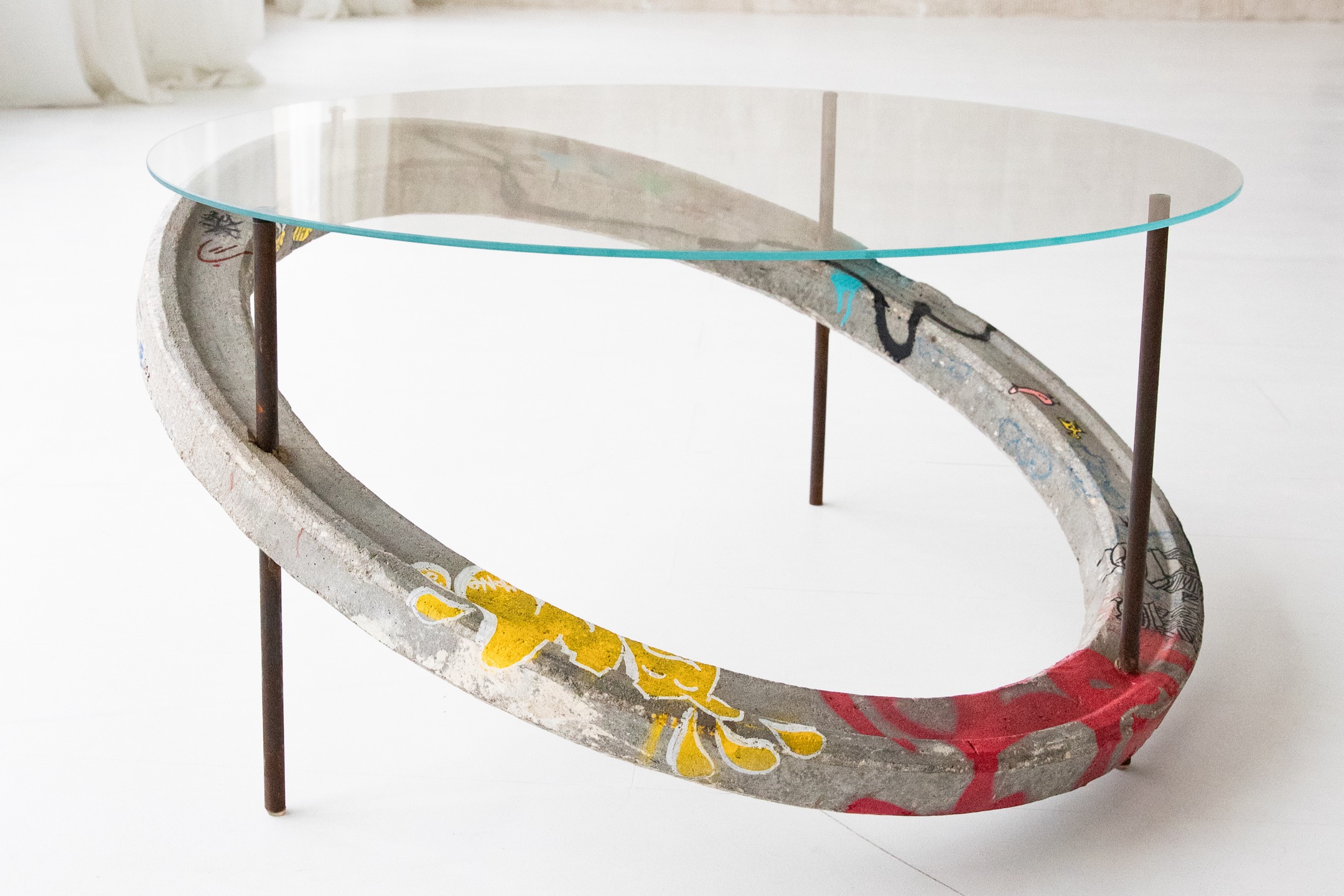


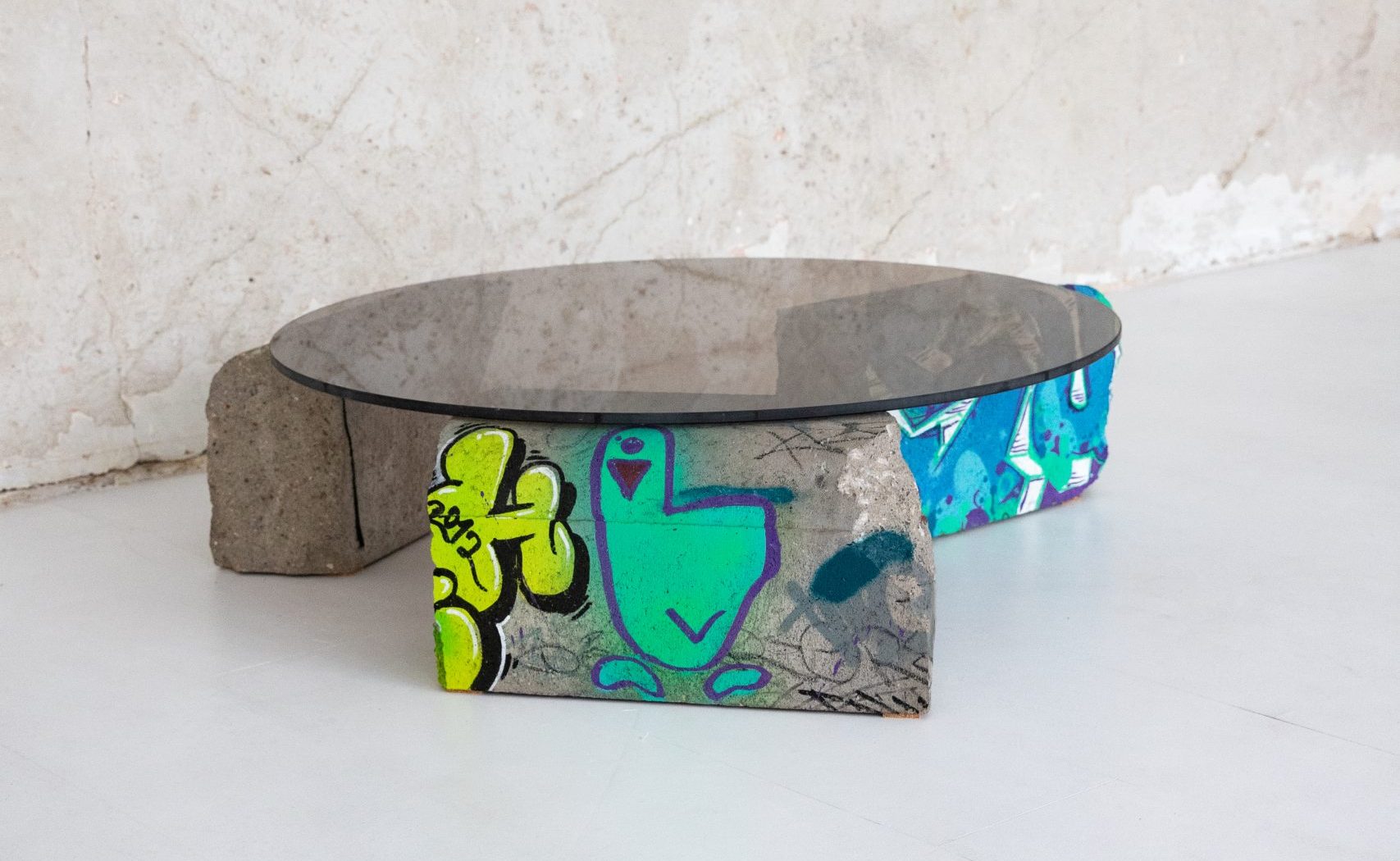
A Well
NR. 008
This coffee table is a synthesis of brutalism, street art and design! It is a unique combination of art and functionality, where the main accent is a salvaged concrete well ring. Originally defective and doomed to be forgotten, it is now reborn as a contemporary design object, embodying the ideas of reuse and rebirth.
The ring is not only a visual center, but also an essential structural part. A system of three metal legs pierces the concrete, thus creating a solid support for both the ring itself and the glass surface above. This detail is thought out not only from an engineering but also aesthetic point of view – the metal lines contrast with the brutal, uneven texture of the concrete, and the glass gives a feeling of lightness, as if floating in the air.
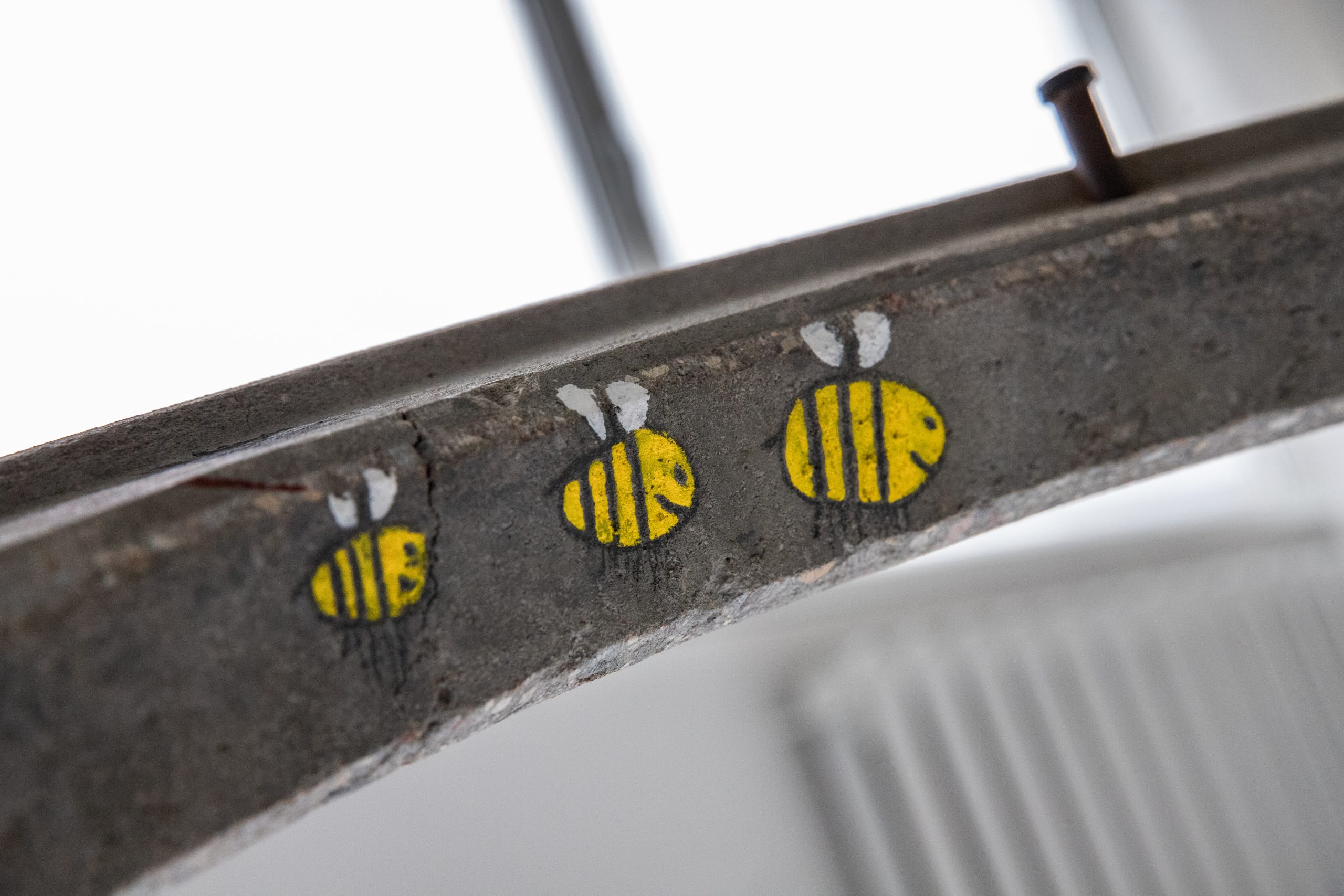
Decorated with original graffiti signs, this ring also becomes a manifestation of urban culture. The tags and drawings used have their own language – it is the voice of the city, transferred to the interior. A yellow, angular character with an expressed emotion, holding an ice cream cone. This figure symbolizes the struggle between the banality of everyday life and the rebellion of creativity – even an ice cream cone becomes a weapon here. A stylized bird, stepping forward. Its simplicity and courage represent freedom, movement and independence – the main values of street art. A bright, orange bubble-shaped character with a face and a cap. It exudes playfulness, but at the same time conveys a strong emotional charge. It is like the personification of the spirit of the city – smiling, but also ready to fight for its place. Three bees, perched on a concrete ring, between the city sign and the layer of street art, are a subtle but very meaningful element. These bees are like a bridge between the man-made world and nature, between the industrial legacy and the life that we can still preserve. The bees in this composition are not just random drawings. They are a reflection of security, connection and sustainability. Bees also symbolize the importance of community and interaction: just as they work together, so too can we work together to protect the world we live in.
It is not only an aesthetic detail, but also a profound ecological statement, inviting us to reflect on sustainability, nature conservation and the preservation of life – topics that are more important today than ever. Each graffiti, each line of concrete striations tells a story about the time, the street culture and the attitude of the creator. It is like a capsule of concrete and glass – brutal but warm, rebellious but harmonious.
*Price varies based on size and artwork detail.
CONTACT ME
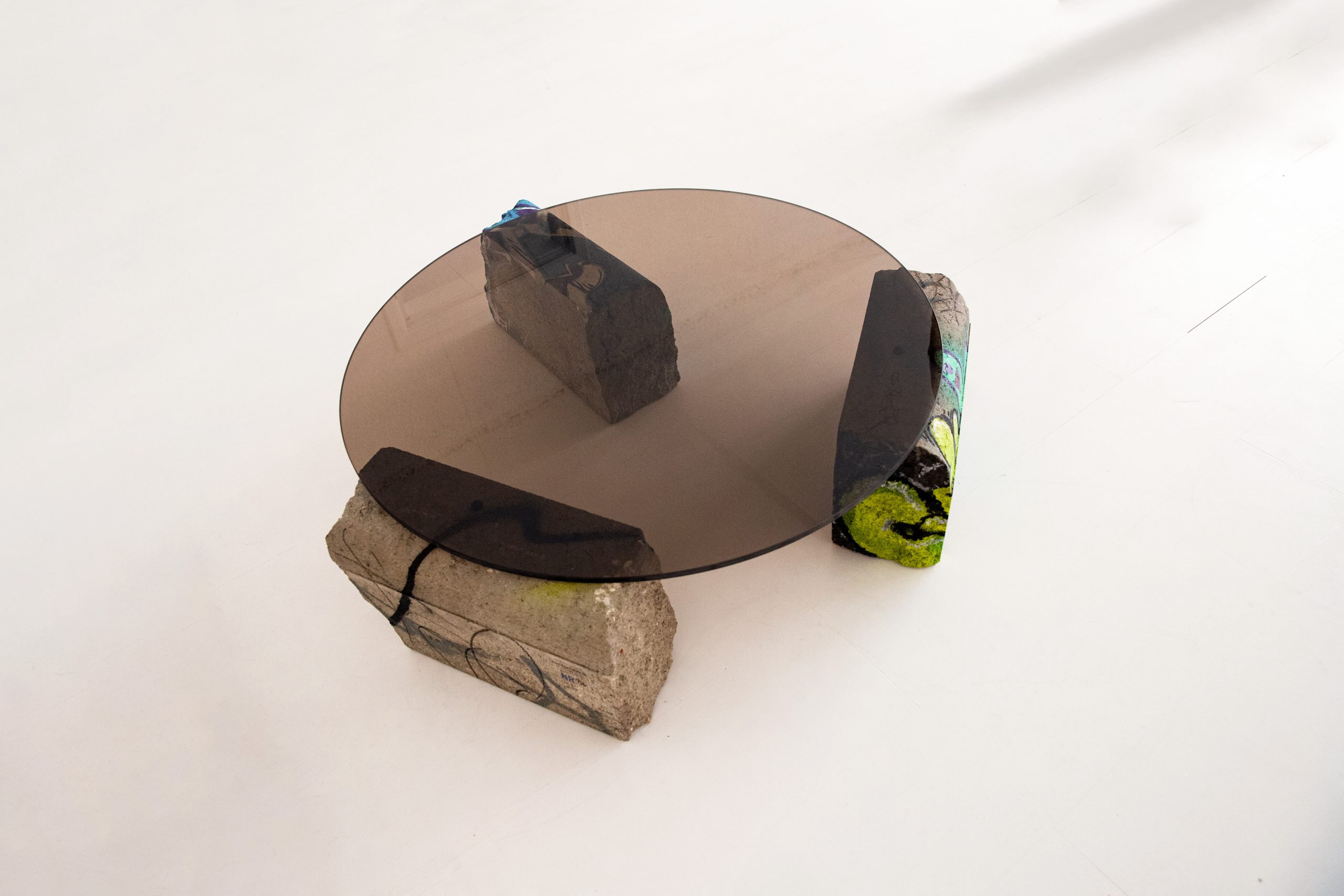
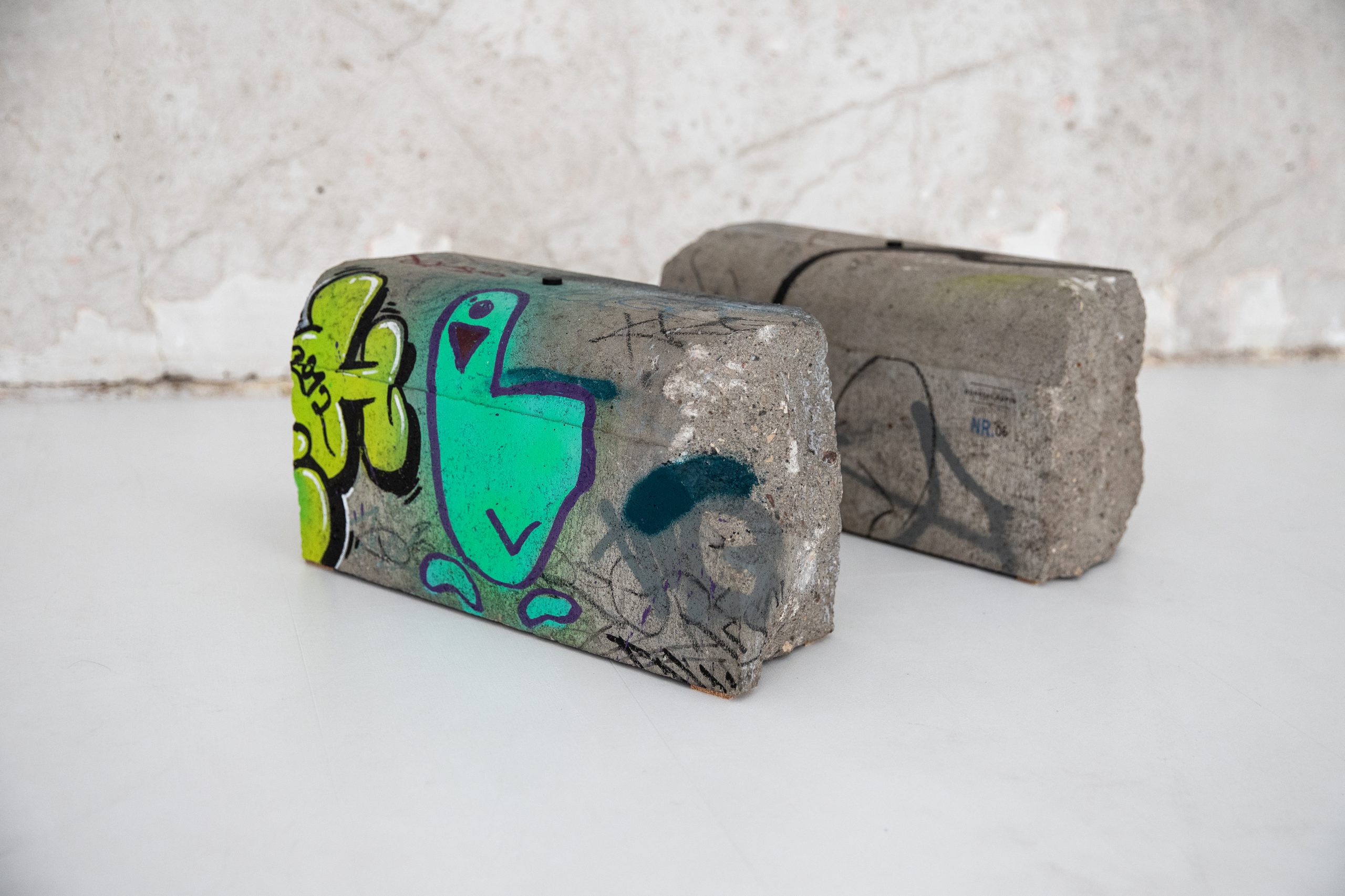
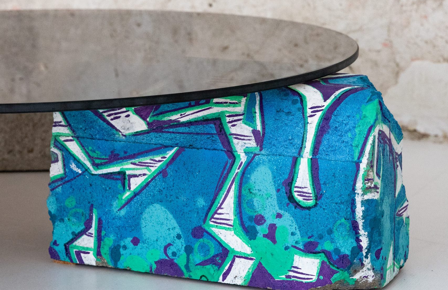


Lying curbs
NR. 006
It is like a symbol of duality, chaos/order. The haphazardly thrown street curbs are united by structures of order, tinted glass, which complement and connect each other. The ends of the curbs are like freedom, which has no rules, does not oblige the structure, allows you to make mistakes and grow through it. If you stumble, you can painfully remember this. Kaunas “Durna Antis” is depicted – a symbol of the city’s spirit.
This iconic character was born on the streets of Kaunas as a simple, ironic and slightly stupid bird. It symbolizes the freedom to create, a gentle spirit of rebellion and a humorous approach to city life. Not a pretension, but a look – at yourself, at the city, at the absurd everyday life. On the inner side of the curb, a brightly colored, closed-eyed bird is hiding – a street art metaphor about inner freedom and a creative state. His colorful writing and calm gaze invite you into a world where dreams and reality meet.
*Price varies based on size and artwork detail.